CZCN

sports event branding
#BRANDING
#GRAPHICDESIGN
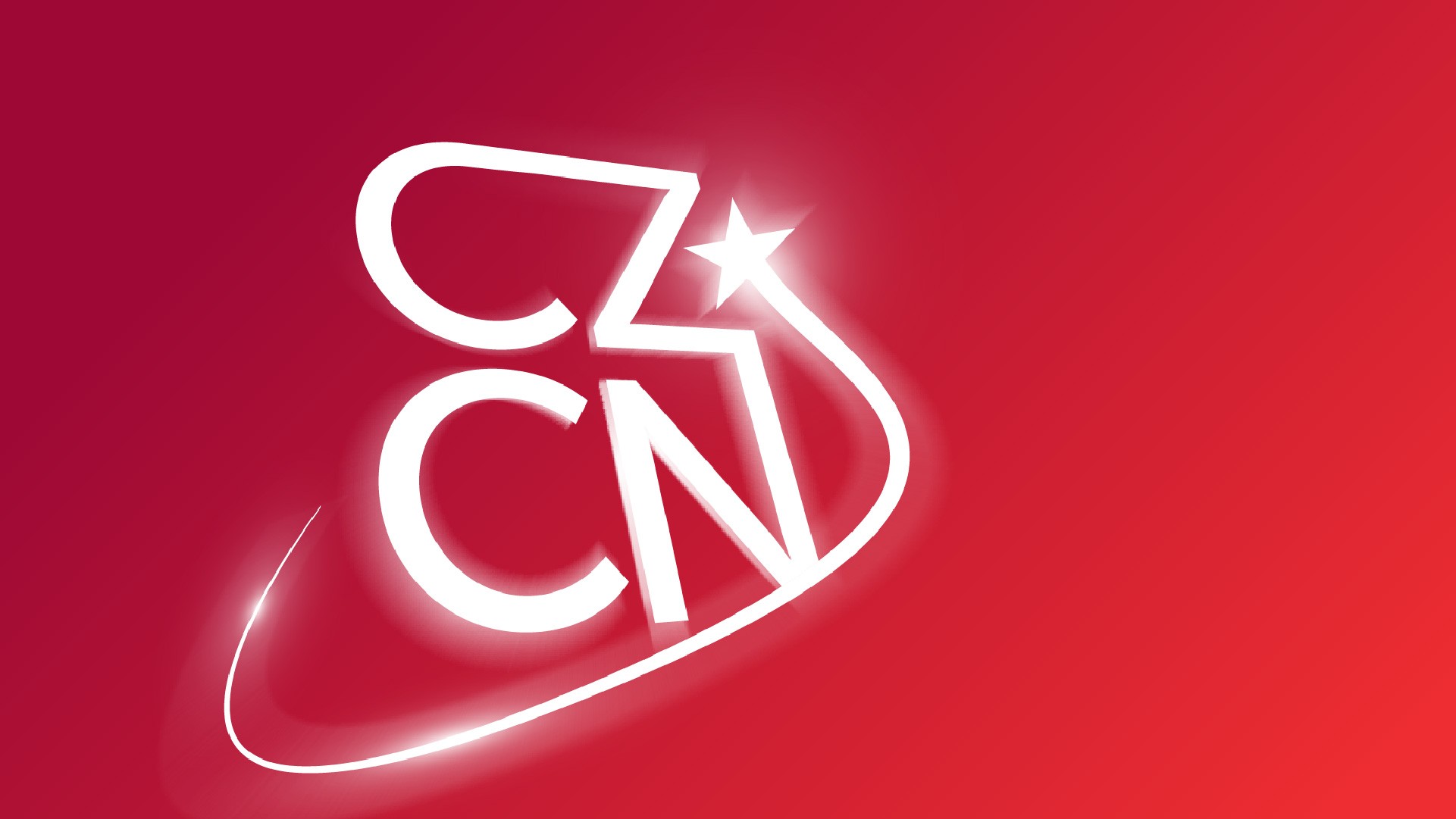


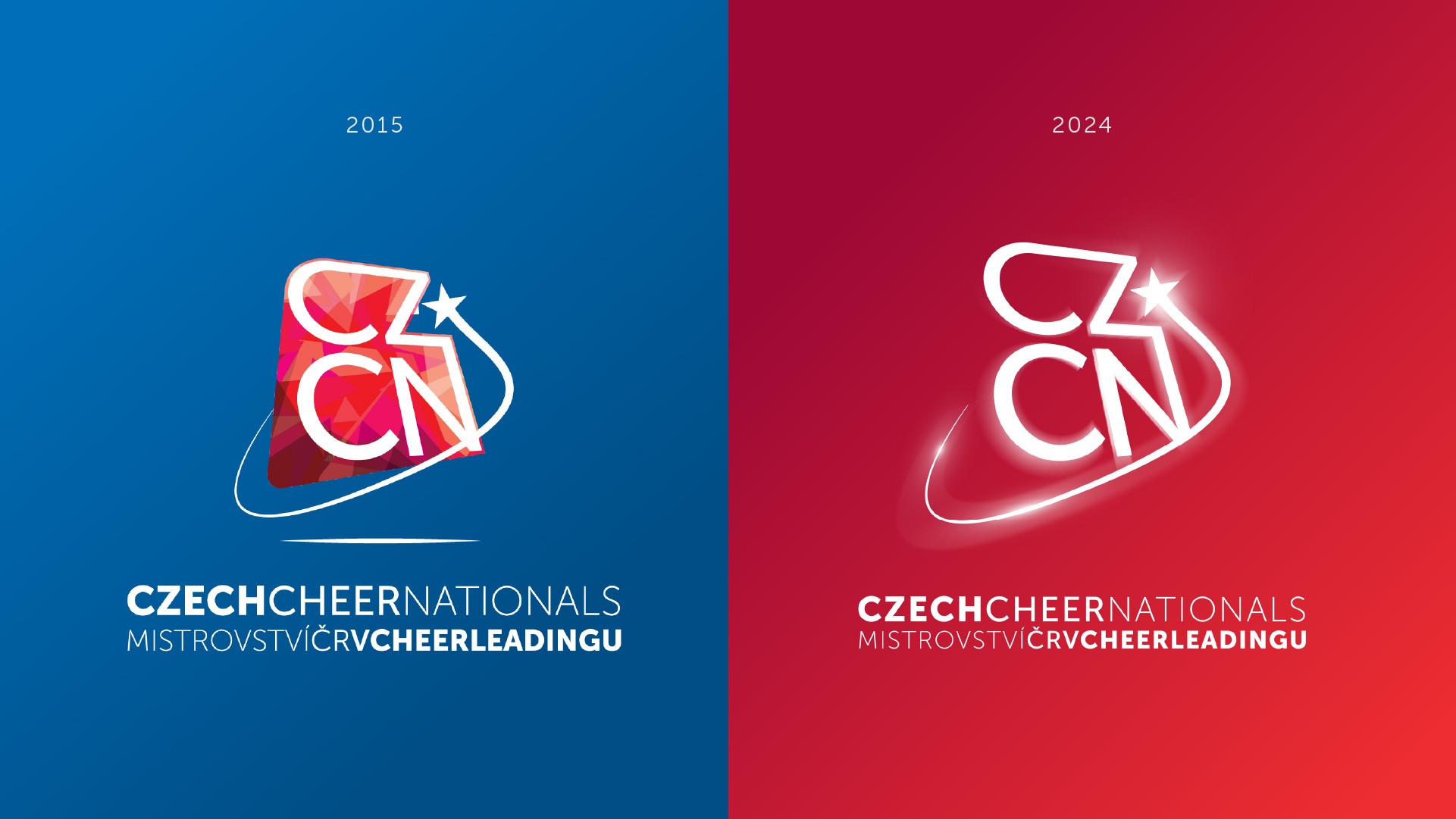
01 Logo Refresh
Honoring the old
CZCN had a recognizable logo for almost a decade, and it made sense to build upon this existing foundation to maintain familiarity and brand continuity.
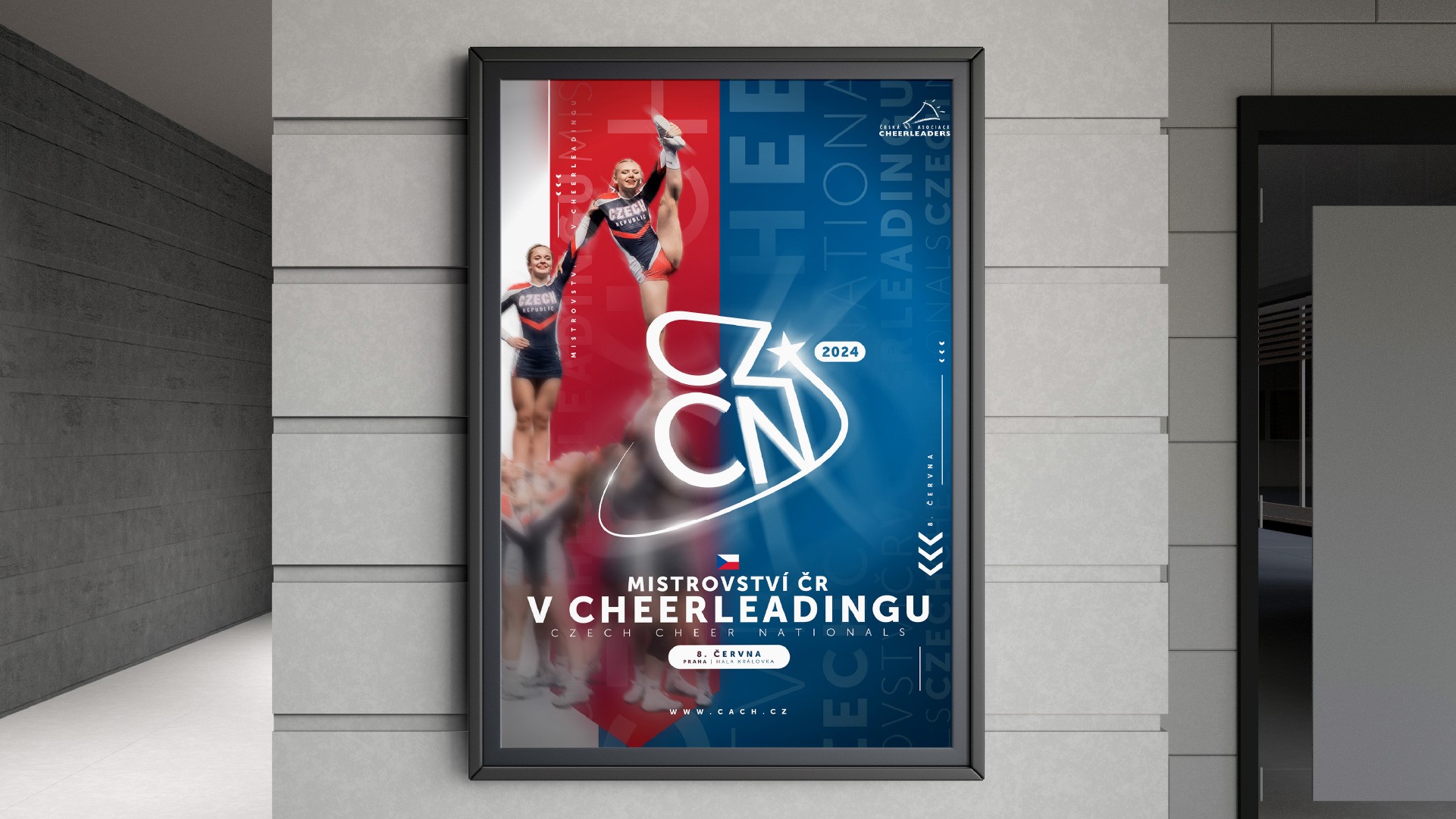
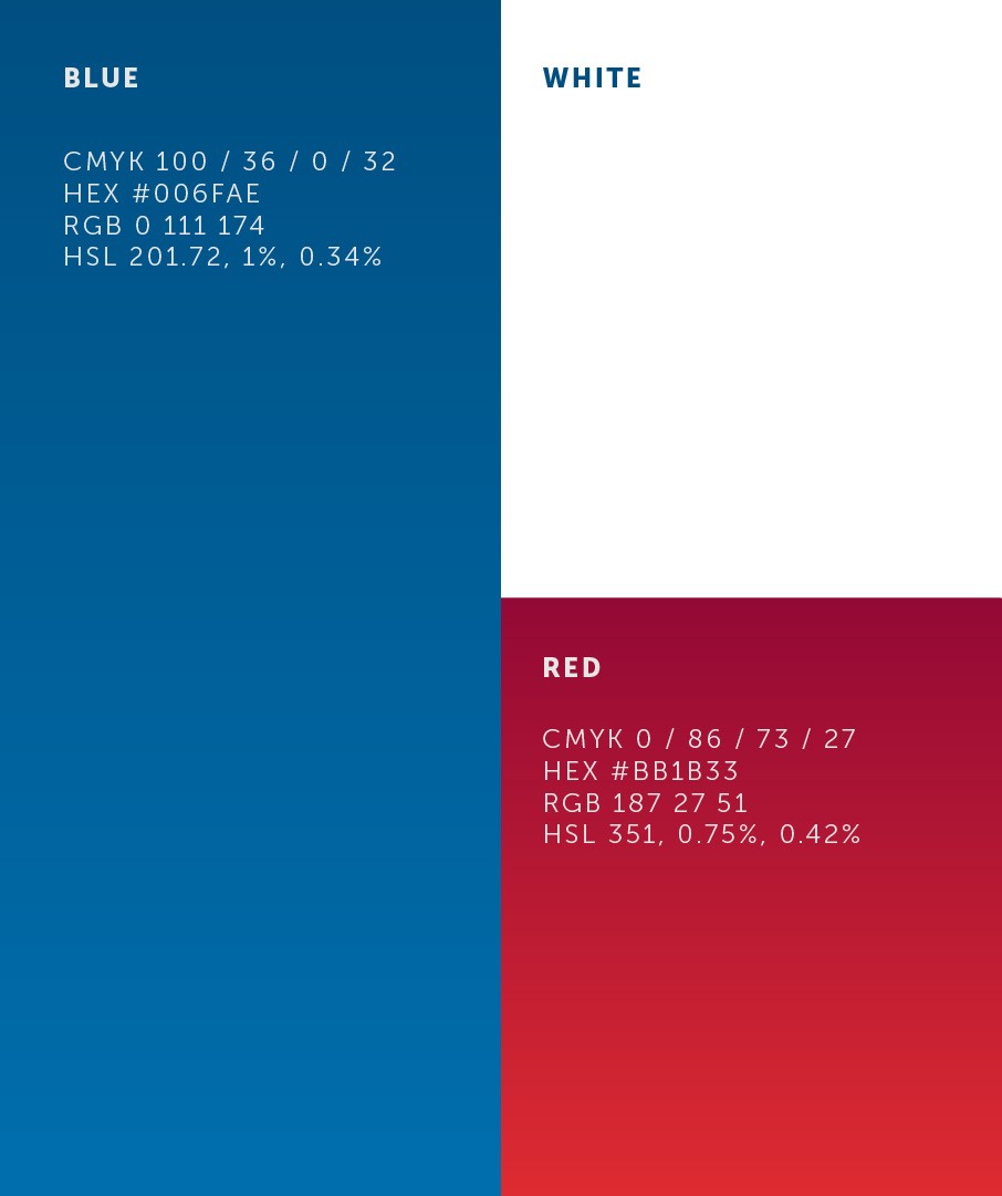
02 Colors & Elements
Nationalism meeting modern sportsmanship
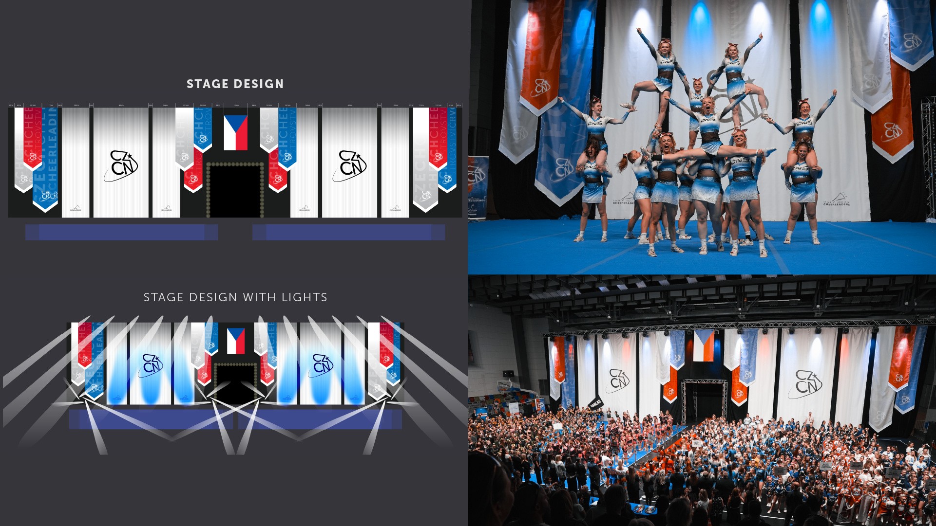
White, red, and blue—the tricolor of Czechia—serves as the foundation for the entire design, used in varying proportions. This presented a unique challenge, as the colors could easily evoke associations with either the Soviet era or American aesthetics. However, when paired with depth and carefully crafted design elements, the result successfully established its own identity. The final design strikes a balance, representing a modern sports aesthetic while staying true to Czech heritage.
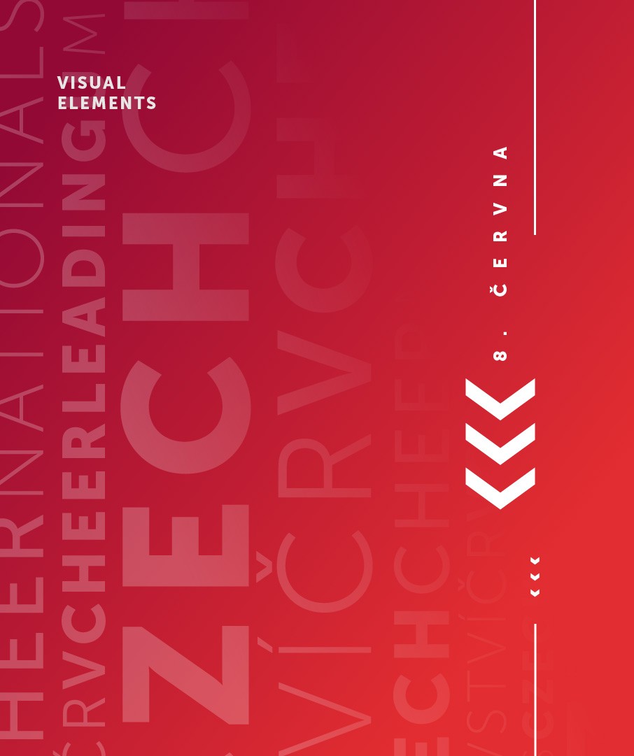
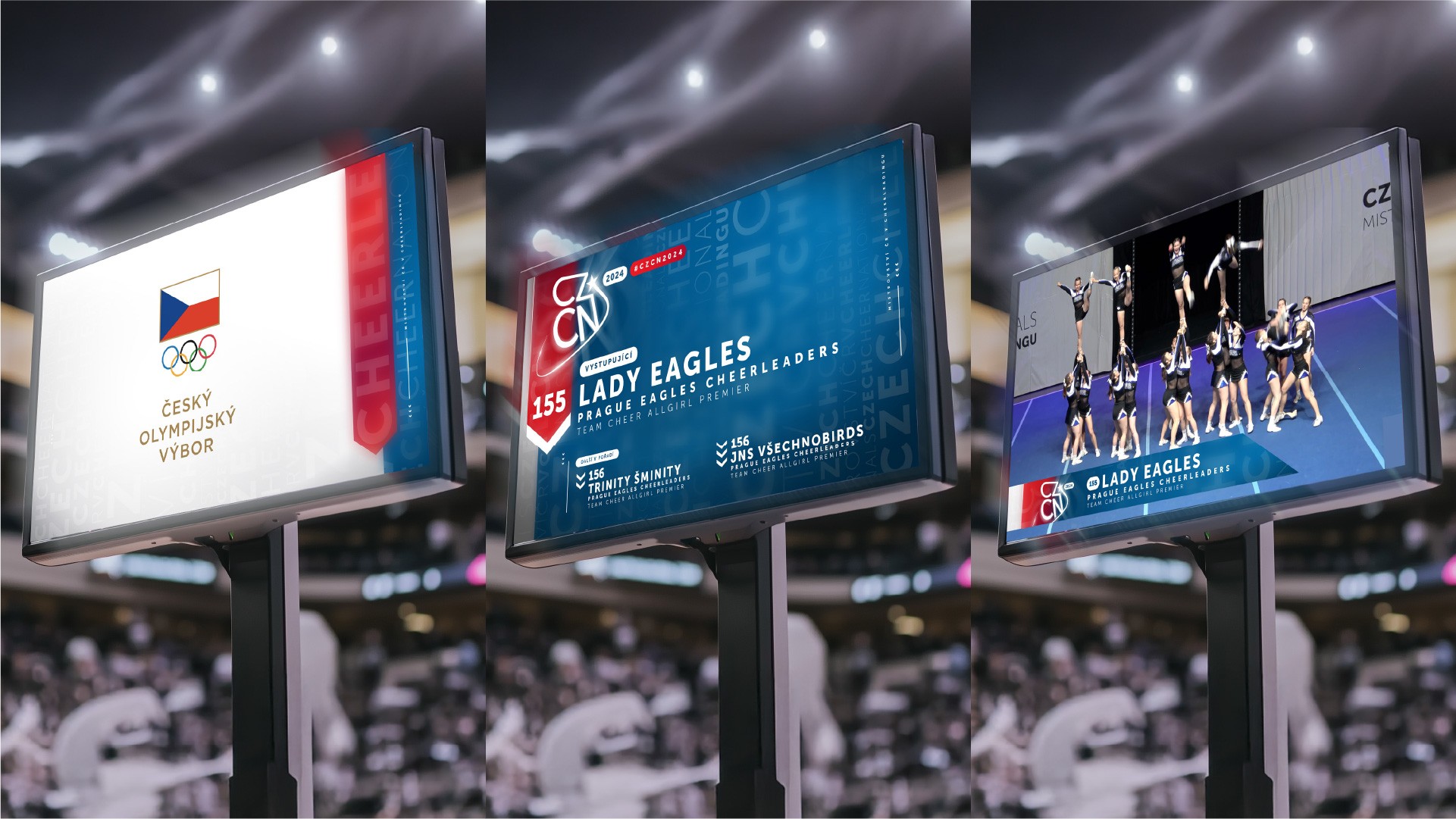
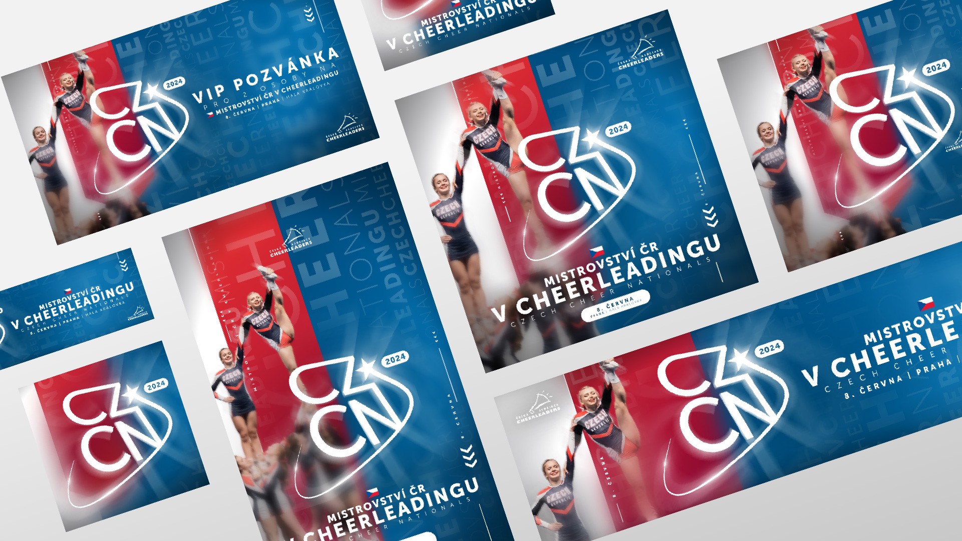
Variety of use
For an event of this scale, it is crucial to ensure that branding remains consistent across all use cases.